LibreOffice Google Summer of Code Final Report
My final report for the work done since May till August in LibreOffice codebase under GSoC 2024
PROGRAMMINGOPEN-SOURCE
Devansh Varshney
8/26/202415 min read


The image logos are protected by copyright to LibreOffice and GSoC.
Adding native support for histogram chart and its variations
Mentor - Tomaž Vajngerl (IRC: quikee)
https://tomazvajngerl.blogspot.com/ https://events.documentfoundation.org/libreoffice-conference-2022/speaker/3VCKHM/
In March 2024 when I started preparing for the proposal, I did not realize that the time would surpass this fast and here I am writing my final report.
My task was Adding the Native Support for the Histogram Chart and its Variations and if time permits other newly introduced charts from Microsoft Office 2016.
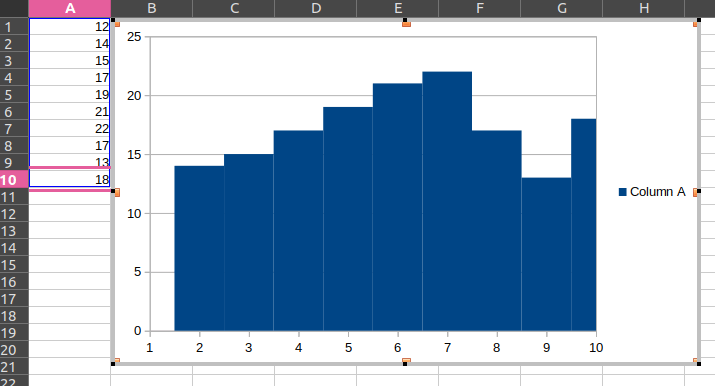
What is a Histogram?
A Histogram is a type of bar graph that shows how often different numbers or ranges appear in a dataset.
Imagine you're sorting a big pile of shoes by size. A histogram is like a picture that shows how many shoes you have in each size group. A histogram helps you do that by grouping the numbers into ranges (like 0-10, 11-20, etc.) and showing how many numbers fall into each range.
Key Concepts:
Binning: This is like sorting your data into different boxes, much like sorting the shoes into different boxes based on size ranges. Each box is called a bin.
Frequency: This is just a count of how many numbers fall into each bin. If you have 10 test scores between 50 and 60, the frequency for that bin is 10.
Overflow and Underflow Bins: These are special bins for numbers that don't fit into your regular bins.
Overflow Bin: If a number is too big for your highest bin, it goes here.
Underflow Bin: If a number is too small for your lowest bin, it goes here.
I said type of bar graph, so what is the difference Between a Histogram and a Bar/Column Chart:
Data Type: Histograms are used for numbers that fall within a range (like test scores), while bar charts are for categories (like types of fruit).
Bar Placement: In histograms, the bars touch each other because the ranges are continuous. In bar charts, the bars are spaced out because the categories are different.
Axis Labels: The x-axis in a histogram shows ranges of numbers (like 0-10, 11-20), while in a bar chart, it shows categories (like apples, oranges, bananas).
Why and When to Use a Histogram:
Histograms are super useful when you want to see the overall pattern or distribution of your data. For example, if you want to know how students did on a test, a histogram can show you if most students got average scores, if there were lots of high or low scores, or if the scores were spread out evenly.
Preferred Use Cases:
When you need to see how data is spread out.
When you're looking for patterns, like a lot of people getting similar scores.
When you want to compare how different groups of data are distributed.
Analyzing continuous data
Different Types of Histograms:
Depending on your data, histograms can look different:
Uniform Histogram: All bins have about the same number of data points.
Bimodal Histogram: There are two peaks, showing two common ranges.
Skewed Histogram: The data leans more to one side, showing an imbalance.
Multimodal Histogram: There are more than two peaks, showing multiple common ranges.
Cumulative Histogram: This one adds up the frequencies as you go along, showing the total frequency up to each bin.
Histograms in MS Office 2016:
In Excel 2016, you can easily create histograms. Excel offers a few types, including:
Regular Histogram: A standard histogram showing how data is distributed.
Pareto Histogram: A histogram where the bars are sorted from highest to lowest, making it easy to see which bins have the most data.
Binning in Histograms:
The choice of binning is critical because it affects the histogram's appearance and interpretation:
Fixed Width Binning: All bins have the same width. This is the most common method.
Adaptive Binning: The bin width can vary to accommodate areas with more or less data density.
Binning Calculation Methods:
Several methods can be used to calculate the optimal bin size, including:
Sturges' Rule: A simple method based on the number of data points.
Square Root Choice: Uses the square root of the number of data points.
Freedman-Diaconis Rule: Takes into account the data spread (interquartile range).
What Microsoft Uses and Why:
Microsoft Excel typically uses a variation of these rules to calculate bin sizes but defaults to Sturges' Rule because it provides a balance between simplicity and effectiveness for most datasets. However, users can manually adjust the bin size to suit specific needs.
Why Scott's Rule?
Consideration of Data Spread: Scott's Rule takes into account the data's standard deviation, providing bins that better reflect the data's actual distribution rather than just its size.
Balanced Binning: By considering the number of data points and their spread, Scott's Rule aims to create bins that give a balanced view without oversimplifying or overcomplicating the histogram.
Good Default Choice: For many datasets, especially those that follow a normal distribution, Scott's Rule offers an optimal bin width, ensuring a clear and informative histogram without much manual adjustment.
Why Not Other Rules?
Other rules like the Freedman-Diaconis Rule might offer more precision in certain scenarios by considering the interquartile range. Still, they can be more complex and might not be as universally applicable for default settings.
The Square Root Rule, while extremely simple, doesn't consider data distribution, potentially leading to less optimal histograms for non-uniform data.
How Scott's Rule Works:
Focus on Data Spread and Size: Scott's Rule looks at both how many data points you have and how spread out they are (via standard deviation).
Statistical Basis: It uses the formula binwidth = 3.49 * σ / (n^(1/3)), where:
σ is the standard deviation of the dataset.
n is the number of observations. This formula aims to minimize the mean integrated squared error for normally distributed data.
Moderate Bin Size: The result is a bin width that increases slowly as the number of data points increases, balancing detail with clarity.
Why It's Useful:
Balance: Scott's Rule strikes a balance between statistical rigour and simplicity, making it suitable for a wide range of datasets in software like Excel where ease of use is paramount.
Simplicity with Structure: Although it involves more calculation than some methods, it provides a structured way to bin data, ensuring histograms are neither too cluttered nor too vague, offering a clear representation of data distribution.
In essence, Scott's Rule is about achieving that "just right" bin size to represent your data accurately and effectively, particularly for datasets that approximate a normal distribution.
Now the question of why are we talking about MSO2016 when we are adding the support in the LO?
Microsoft Office (MS Office) and its associated file formats have indeed become a de facto industry standard due to their widespread use and if a lot of people use something we have to make sure that when they use our service for their work they won't face any challenge.
But, this is not only the reason for us to add support for these new chart types in our day-to-day life as the increase of data and in research we have to analyze and make sense out of a humongous amount of data more than ever. Providing better features and tools to people make their work easier.
This could also be seen from this CERN tutorial on How to plot a Histogram from a Column Chart which is a painful clunky workaround https://indico.cern.ch/event/977476/contributions/4204938/attachments/2191304/3703670/EN-Plotting-a-histogram-in-libreoffice.pdf
So, how we approached it?
This was a simple 3-step process -
The first was to copy-paste a similar chart type, which in this case was a bar/column chart.
The second was to start making modifications to this copied structure to align it with the Histogram chart.
And the third was to add the OOXML/ODF import and export support to this newly added chart.
But, what are OOXML and ODF?
OOXML (Office Open XML) and ODF (Open Document Format) are both standards that define how office documents (like text files, spreadsheets, and presentations) are structured, stored, and exchanged.
https://wiki.documentfoundation.org/LibreOffice_OOXML https://tfir.io/never-use-microsofts-ooxml-pseudo-standard-format/
OOXML (Office Open XML):
This is Microsoft's XML-based file format, used in newer versions of MS Office (e.g., .docx, .xlsx, .pptx).
It became an ISO standard (ISO/IEC 29500) in 2008, which technically makes it an open standard.
However, there has been controversy over its standardization process and the complexity of the full specification.
ODF (Open Document Format):
This is an open, XML-based file format developed by OASIS and used by LibreOffice, OpenOffice, and others.
It became an ISO standard (ISO/IEC 26300) in 2006.
It's considered more truly open and less complex than OOXML.
MS Office's dominance:
Due to MS Office's widespread use in businesses and institutions, its formats (both the older .doc, .xls, .ppt and the newer OOXML formats) are often treated as de facto standards.
Many organizations require documents in MS Office formats, which reinforces its position.
Proprietary aspects:
While OOXML is standardized, MS Office uses some proprietary extensions and implementations that can cause compatibility issues with other software.
In summary, while OOXML is technically a standard, MS Office's implementation and market dominance have made its formats the practical industry standard. ODF is a more open alternative, but it has less widespread adoption. The situation is complex, with ongoing debates about openness, interoperability, and vendor lock-in in the office software market.
The XML structure of XLSX and ODS files reflects their different design philosophies and origins. Here’s a comparison of how they are structured:
1. File Packaging:
XLSX (OOXML):
ZIP Container: XLSX files are actually ZIP files containing multiple XML documents and other resources (like images or charts).
File Structure: The content is organized into different folders within the ZIP archive, including:
/xl/: Contains the main workbook data, worksheets, shared strings, styles, and more.
/docProps/: Contains document properties like metadata.
/_rels/: Contains relationships between different parts of the document, defined in XML files.
Multiple XML Files: Each part of the spreadsheet (data, styles, relationships, etc.) is stored in separate XML files.
ODS (OpenDocument):
ZIP Container: Like XLSX, ODS files are also ZIP files containing multiple XML documents.
File Structure: The content is organized into a simpler structure:
content.xml: Contains the main content of the spreadsheet (data, formulas).
styles.xml: Defines the styles used in the document.
meta.xml: Contains metadata about the document.
settings.xml: Holds application-specific settings.
manifest.xml: Lists the files contained in the ODS package and their MIME types.
Fewer XML Files: ODS tends to have a more straightforward structure with fewer separate XML files compared to XLSX.
2. XML Content:
XLSX (OOXML):
Namespaces: Uses specific namespaces like w: for workbook elements, s: for styles, etc. This helps in identifying different parts of the document.
Complex Structure: Each part of the spreadsheet is defined in a detailed and often complex XML structure. For example:
<sheetData>: Contains rows and cells of a worksheet.
<c> (cell): Each cell is defined with attributes like its reference (r), style (s), and data type (t).
<v> (value): The actual value of the cell.
Relationships: Uses relationship files to link different parts of the spreadsheet, making it possible to separate data, styles, and other elements into distinct files.
ODS (OpenDocument):
Simpler Namespaces: Uses namespaces like office:, style:, table:, etc., but generally has fewer and simpler namespaces than OOXML.
Straightforward Structure: ODS XML is more straightforward and less verbose. For example:
<table:table>: Defines the spreadsheet table (worksheet).
<table:table-row>: Represents a row in the table.
<table:table-cell>: Represents a cell in the row.
<text:p>: The actual content of the cell.
Integrated Content: Often, styles, data, and other elements are integrated into the main XML files, rather than being separated like in XLSX.
3. Styling and Formatting:
XLSX (OOXML):
Separate Styling: Styles are defined in a separate XML file (styles.xml) and applied using references in the main data files.
Complex Styling: Can handle complex styling rules, conditional formatting, and custom themes, often making the XML structure more complex.
ODS (OpenDocument):
Integrated Styling: Styles are typically included in styles.xml but are more integrated into the main content.
Simpler Styling: While it supports advanced styling, the XML structure is generally simpler and easier to read.
4. Extensibility:
XLSX (OOXML):
Highly Extensible: Designed to support a wide range of features and custom extensions, which makes the XML structure more complex but also more powerful.
ODS (OpenDocument):
Moderately Extensible: While it supports extensions, the focus is more on simplicity and openness, leading to a less complex XML structure.
Summary:
XLSX has a more complex, modular XML structure with many separate files, making it highly extensible but also more challenging to parse and understand.
ODS has a simpler, more integrated XML structure, focusing on openness and ease of use, but it may not support as many complex features as XLSX.
Both formats use XML at their core, but the way they organize and use XML reflects their different design goals: XLSX prioritizes compatibility with Microsoft’s powerful and feature-rich Excel application, while ODS emphasizes openness and simplicity.
https://summerofcode.withgoogle.com/programs/2024/projects/hGYE3dQZ
Here, is my 14-week timestamp along with the https://lists.freedesktop.org/archives/libreoffice/ mails -
For Week 1 and Week 2, My top priority was to make the new Histogram chart type selectable from the UI.
May 8th, 2024 https://lists.freedesktop.org/archives/libreoffice/2024-May/091918.html
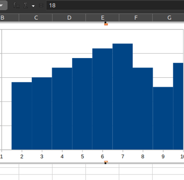
For Week 3 and Week 4, For these weeks I kept working on existing chart copy alignment with making the Bar Gap to Zero.
May 23rd, 2024 https://lists.freedesktop.org/archives/libreoffice/2024-May/091985.html
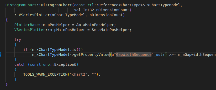
For Week 5 and Week 6, been stuck with a typo which was corrected by my mentor regarding the width of the small case of W for the word Width GapwidthSequence.
June 17th, 2024 https://lists.freedesktop.org/archives/libreoffice/2024-June/092086.html
For Week 6 and Week 7, able to align the Bin and Frequency calculation for the Histogram correctly, but I was using the square root method m_nBins = static_cast<sal_Int32>(std::sqrt(dataPoints.size()));
June 26th, 2024 https://lists.freedesktop.org/archives/libreoffice/2024-June/092111.html
For Week 8 and Week 9, I kept regressing over the view changes, which was quite late as by the time I was trying to access the properties the processing for the chart was done. Hence, my mentor helped with the Model files which need to be placed as the input data needs to be calculated separately.
July 10th, 2024 https://lists.freedesktop.org/archives/libreoffice/2024-July/092173.html
For Week 10 and Week 11, Corrected Bin Calculation with Struge's rule and also the X-axis i.e. [ ] ( ]
July 22nd, 2024 https://lists.freedesktop.org/archives/libreoffice/2024-July/092229.html
Microsoft Office 2016/365 vs our LibreOffice implementation
Google Sheets vs our LibreOffice implementation
For Week 12 and Week 13, I have been trying to get OOXML and ODF compatibility, i.e., Import and Export ability for the chart. I kept remaining stuck here as even after aligning with older similar PR's the result for OOXML remains the same.
August 10th, 2024 https://lists.freedesktop.org/archives/libreoffice/2024-August/092311.html
For Week 14, Kurt's help provided(https://gerrit.libreoffice.org/c/core/+/170666/9) me what should I be looking for and further validated that the changes regarding the OOXML import/export are in the right direction. But, what Tomaz found out about OOXML for 2016 MSO specifically is that it's using an entirely different structure for the new chart types. Which I have attached below.
August 18th, 2024 https://lists.freedesktop.org/archives/libreoffice/2024-August/092349.html
What happened after mid, especially with OOXML?
When I started working for the import-export I picked OOXML first during the proposal phase my mentor put a big emphasis on this and it's indeed important since the majority of the users are on MSO. My initial approach was to look for changes already present and I found Of-Pie which had some properties being set in the ChartTypeDialogController.cxx file.
Later, Tomaž pointed me to an old PR git show de687872926d0 which sort of made changes regarding the OOXML and ODF import/export. I also looked at Kurt's PR which he responded to me over the community mail. Which confirmed that the direction I am taking is correct. https://lists.freedesktop.org/archives/libreoffice/2024-August/092331.html
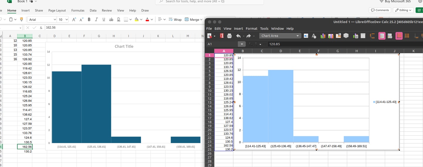
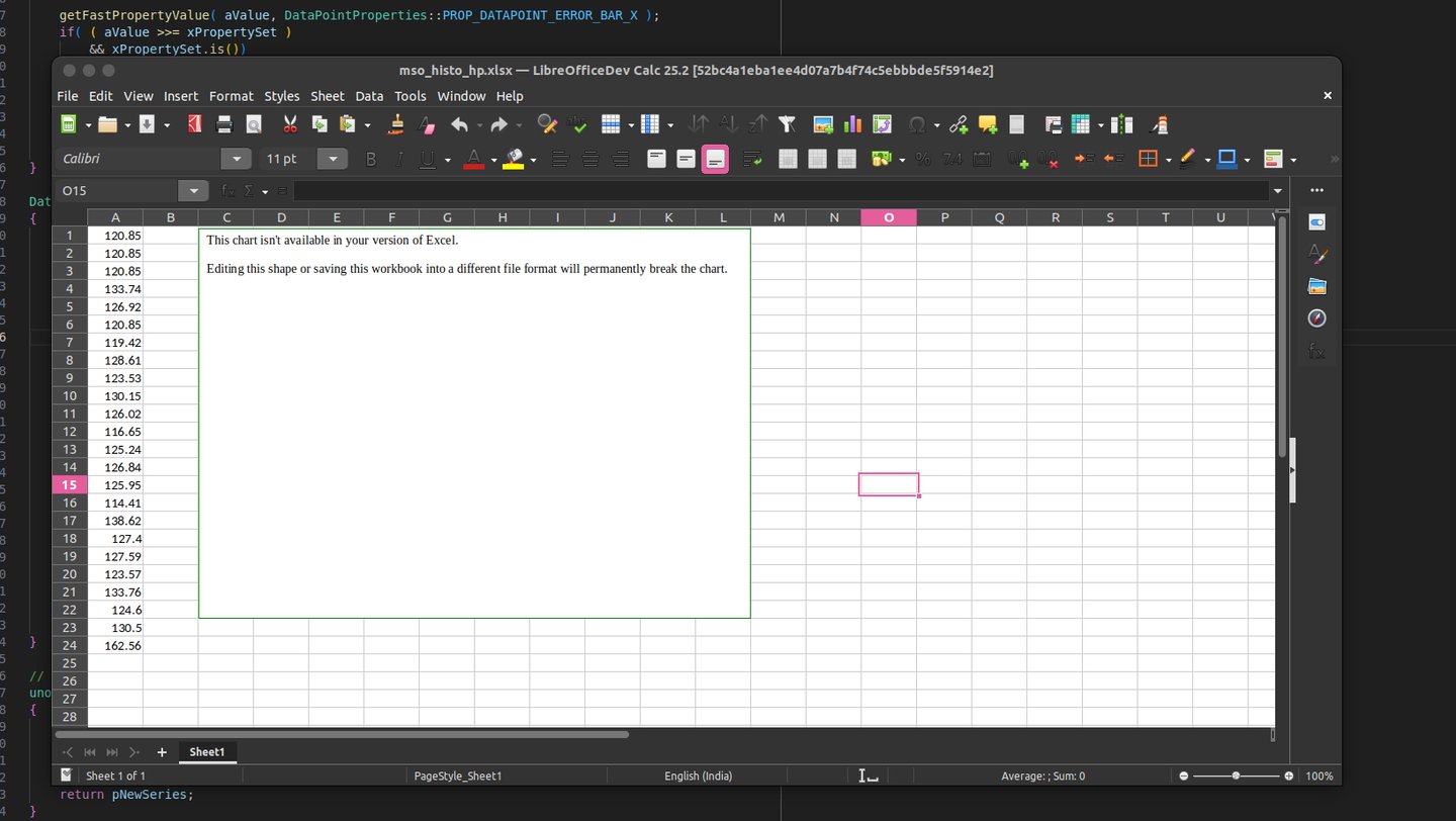
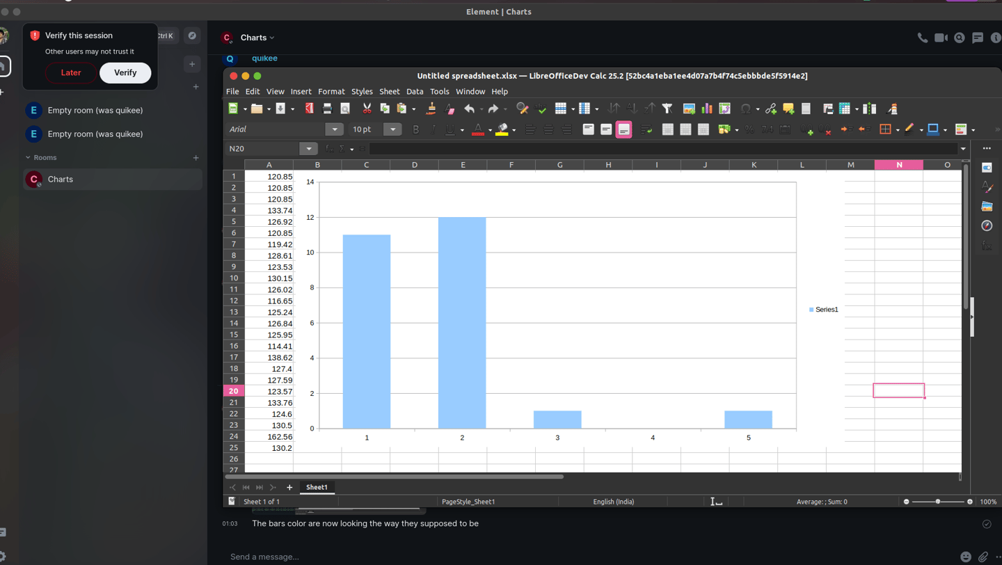
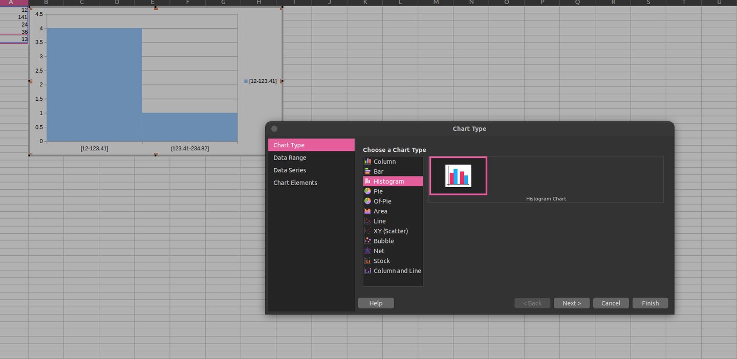
After getting nowhere with my changes the histogram chart created with Google Sheets kept triggering the Bar Chart view while opening the xlsx file.
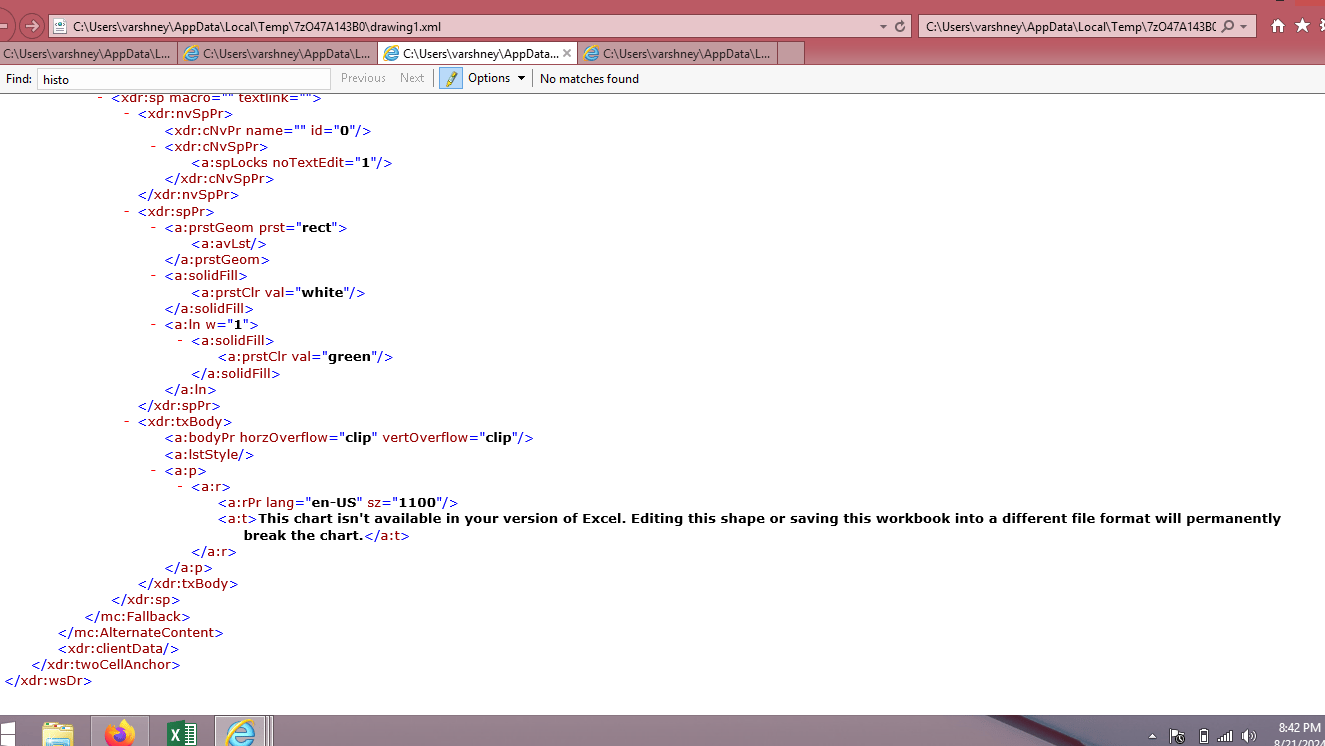
Below is the image of a Histogram Chart created with MSO 2016 onwards reacting to the newly added OOXML support -
After this Tomaž looked into why this text is appearing and it turns out that instead of extending the earlier structure(charts from 2007) MSO created an entirely new structure for these new chart types.
c:chart element is what is supported in our current LibreOffice implementation.
cx:chart element is what is used by the newer MSO implementation.
Here is a brief of what this is all about -
Understanding OOXML: The chartEx namespace is part of the newer extensions to OOXML (Office Open XML), specifically for more advanced chart features in Excel. OOXML is a format used by Microsoft Office applications to store documents.
Current Support: LibreOffice currently supports an older OOXML chart format (c:chart element) defined in the http://schemas.openxmlformats.org/drawingml/2006/chart namespace. This format is more straightforward to import.
New Format: The chartEx namespace, used in newer Excel files, is more complex. It includes advanced features that LibreOffice does not currently support. When Excel saves a file using the chartEx namespace, it can include a mc:AlternateContent element. This element defines:
Primary Content: What to display if the application supports the chartEx namespace. In this case, the chart is defined using the cx:chart element from the chartEx namespace.
Fallback Content: What to display if the application does not support the chartEx namespace. This is typically a message like "This chart isn't available in your version of Excel."
What Needs to Be Done: To support these charts in LibreOffice, you would need to:
Understand the chartEx namespace: Learn how this new format works, including how the cx:chart element is structured and how to interpret it.
Implement Support: Write code in LibreOffice to read and import charts using this chartEx format.
Challenge: Quikee mentions that this task is complex and may take a significant amount of time, as it involves understanding and implementing a completely new and advanced part of the OOXML standard.
More information can be found here -
https://epplussoftware.com/docs/7.0/api/OfficeOpenXml.Drawing.Chart.ChartEx.ExcelChartEx.html
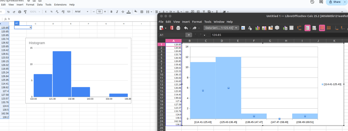
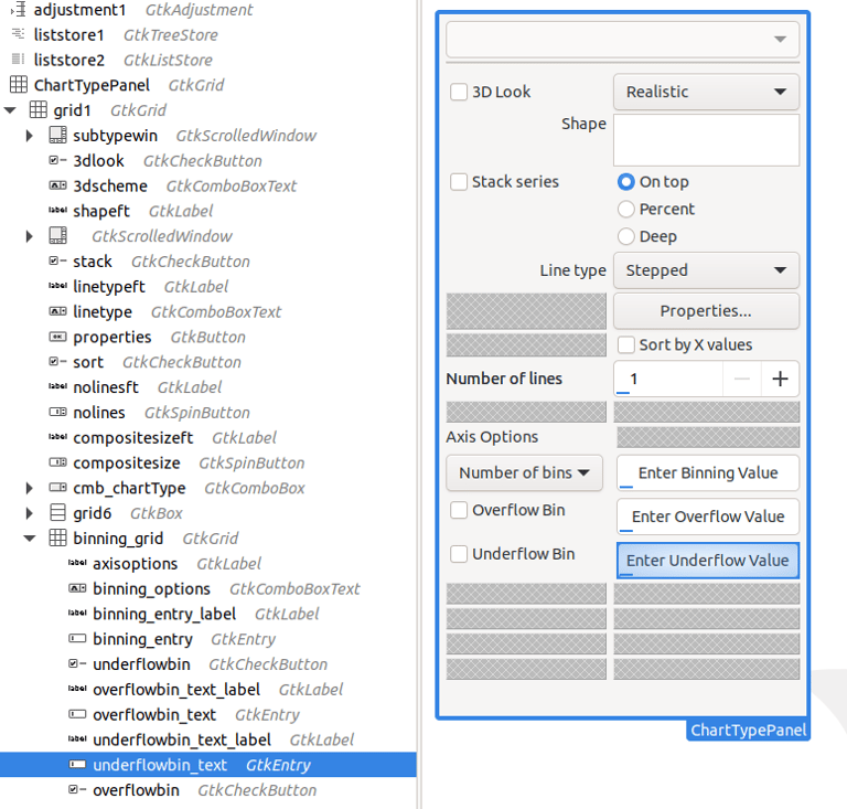
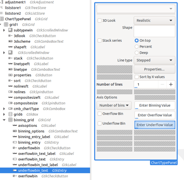
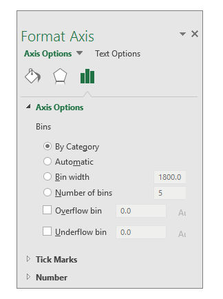
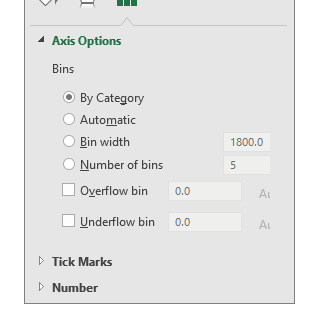
MSO also allows custom binning-
As we saw above besides the default Sturges' method user can also create the range size a.k.a. binning with custom options as seen in the right side image below. The image on the left is how we are approaching adding the Format Axis properties in LibreOffice in the sidebarttype.ui part of tp_charttype.ui which is the 3rd image below -
Related Pull Requests -
Histogram Chart - https://gerrit.libreoffice.org/c/core/+/167068 (merged)
OOXML/ODF - https://gerrit.libreoffice.org/c/core/+/170909 (not-merged)
PR created by my mentor -
Prepare calculated data sequence https://gerrit.libreoffice.org/c/core/+/170153 (merged)
Moving Histogram calculations to HistogramChartType https://gerrit.libreoffice.org/c/core/+/171952 (merged)
My Experience with GSoC 2024
What is my favourite part of participating in GSoC?
Learning not just how to think, but what to think. After a really long, I got something challenging to do to build something.
What do I consider the most challenging part of participating in GSoC?
Paying attention to details. I have a hard time keeping my attention and working in GSoC has highlighted this for me more. I kept missing details right in front of me, and not fully reading and comprehending was a big problem that got highlighted, Reading other people's code(thoughts) and learning why and where they put it this way and understanding why they did something in that way.
How has GSoC helped improve my programming skills?
Everyone keeps talking about what and how to write good code, but I learned, or if I say realize where to write the code.
There is this dialogue of Kevin Spacey from House of Cards, “Power is a lot like real estate. It's all about location, location, location. The closer you are to the source, the higher your property value.”
I perceive it as code is pretty similar to power where you are putting your code will decide the entire structure and complexity of the code.
What advice would I give to contributors participating in GSoC in the future?
Communicate more. I started superbly, but once I reached a pitfall I barely communicated with my mentor as I kept forcing myself to correct the errors, and when I did, I would tell him.
Don't let that happen, if you're stuck in any problem, communicate with your mentor or with the community/team. I think this is a disadvantage which I did for myself, not communicating well and regressing in the hope of getting things done by myself.
How do I rate myself for participating in GSoC?
At the beginning of May 2024, I was aiming for at least 8 out of 10 but by time and being stuck in code I rate my work to be 5/10(personally it's a 4/10).
What is remaining?
Well for the OOXML we have to first introduce the support for the new namespace cx:chart in the LibreOffice codebase then afterwards it would pave the path for the addition of import/export for the other newer chart types also.
For ODF support I have to extend it still carefully as I have done so yet.
The UI changes are in place but having crashes perhaps due to some misalignment in the UI file.
then there are test cases and documentation.
And at last, we have to repeat the same for the Pareto-Histogram chart.
.
Also available on my old blog:
https://devanshvarshney.blogspot.com/2024/08/libreoffice-google-summer-of-code-final.html